Case Study · No. 03
Traveleza "Where comfort meets serenity."
A pin that tells you you've arrived.
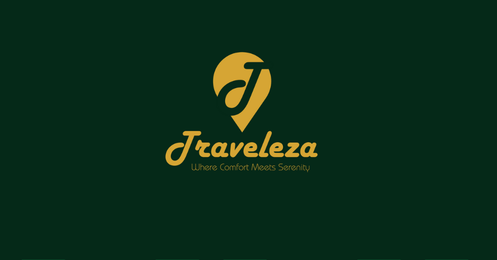
The Traveleza mark fuses a location pin with a stylised leaf and the letter "T" — three ideas collapsed into one fluid shape. It communicates destination, nature, and brand name simultaneously, working equally well embossed on a key card or lit on a resort entrance sign.
Design Approach
The leaf-formed location pin was drawn to feel organic rather than geometric — its curves echo tropical foliage while the negative-space "T" anchors the reader's eye. The script logotype beneath carries a handwritten warmth, as if penned into a guestbook. Gold on deep forest green creates a natural palette that breathes luxury and calm.
 View full size
A surface that breathes tropical rhythm.
The brand pattern takes the pin mark and the script "T" and repeats them at overlapping scales in a tone-on-tone forest green field. The flowing, organic repeat creates a sense of lush canopy — a wallpaper of foliage that can wrap amenity boxes, line shopping bags, or texture a lobby wall.
Pattern Construction
Two elements alternate at different scales and rotations — the full pin silhouette and a cropped script letterform. The monochrome green-on-green treatment lets the pattern serve as a subtle backdrop, never competing with gold foil typography or photography placed over it.
 View full size
At home in its natural setting.
The mark was designed to feel native to resort environments. Here it sits over a poolside photograph — the gold symbol catching the light the way it would on a carved wooden sign or an etched glass partition. The transparency treatment proves the logo works on complex imagery, not just flat colour grounds.
Contextual Application
Testing the mark over real-world photography validates contrast, legibility, and mood. The pin shape holds its clarity even against the complex textures of water, stone, and foliage — confirming it'll work on signage, pool towels, and digital headers.
 View full size
Every touchpoint, a quiet welcome.
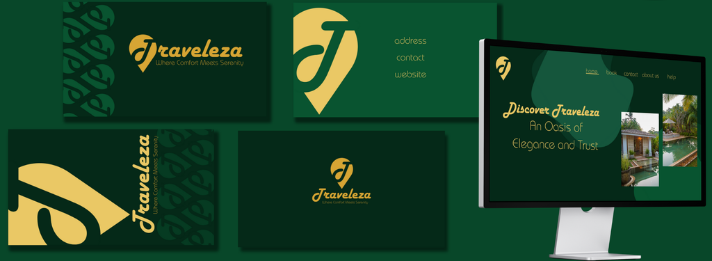
The full brand collateral system spans business cards, stationery, web presence, and presentation materials. Each piece uses the brand pattern as a background texture, the gold script logotype as a centrepiece, and generous whitespace that mirrors the unhurried feeling of a resort experience.
Collateral Craft
Business cards feature the pin logo centred on a forest green field, with the brand pattern running as a sidebar accent. The web landing page pairs lush resort photography with editorial script headings, while presentation decks carry the gold-on-green palette across every slide.
Amenities that feel like a gift.
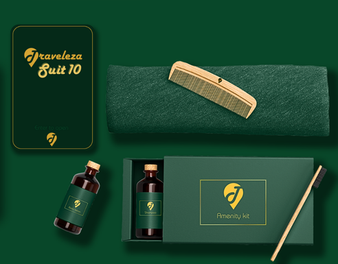
The amenity kit packaging extends the brand into the most intimate guest touchpoints — room key cards, toiletry bottles, a branded comb, and a presentation box. Every item carries the forest green palette and gold logo, turning functional objects into keepsakes worth bringing home.
Packaging Craft
The amenity box features a matte forest-green sleeve with the pin logo foil-stamped in gold. Room key cards carry a suite number in script alongside the logo, while amber glass toiletry bottles echo the warm notes of the gold palette. Even the bamboo toothbrush aligns with the brand's natural, unhurried aesthetic.
 View full size
The Complete Work
Every element, one frame.
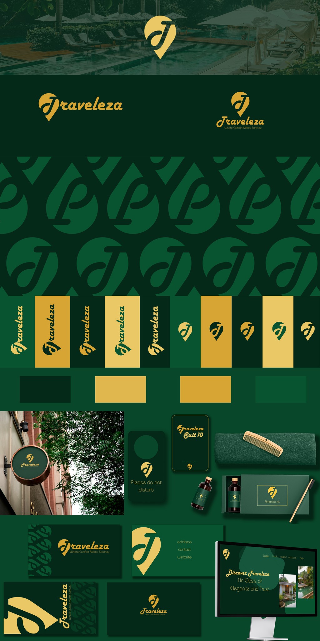
Logo mark, script logotype, colour system, brand pattern, collateral suite, web presence, and amenity kit packaging — the entire Traveleza identity brought together as a single brand sheet.
Project Outcome
A brand built for
slowness and serenity.
Traveleza now carries a complete identity system — from entrance signage to amenity kit — that wraps every guest touchpoint in the same feeling of calm luxury. Each element was designed to feel as unhurried as the resort experience itself, never overwrought, always welcoming.
← View all projects