Case Study · No. 02
Ethereal
Epiphany
"Brilliance unveiled."
A monogram that reads like a hallmark.
The Ethereal Epiphany monogram interlocks "E" and "E" within a bracket-frame — a nod to the hallmark stamps found on fine precious metals. The intertwined letterforms create a sense of permanence, as if the mark itself has been engraved rather than designed.
Design Approach
Built on a high-contrast serif skeleton, each letter was optically weighted to lock into the other without losing legibility. The surrounding bracket frame grounds the composition, giving it the proportions of a jeweler's stamp — square, authoritative, and recognisable at ring-box scale.
 View full size
Letters with quiet authority.
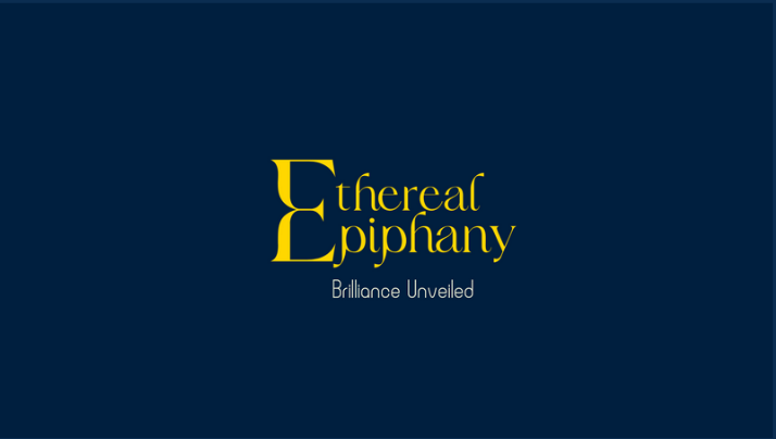
The "Ethereal Epiphany" wordmark uses a classical high-contrast serif with deeply sculpted terminals and generous swash capitals. Below, the tagline "Brilliance Unveiled" sits in a measured italic — soft enough to feel aspirational, structured enough to feel assured.
Typographic Decisions
The drop-cap "E" on each word creates a visual signature that echoes the monogram. Kerning was tightened slightly between the swash serifs to create a continuous reading line, so the brand name feels like a single word even though it's two. Gold on navy ensures maximum contrast under both daylight and boutique lighting.
 View full size
A monogram field of restrained luxury.
The brand pattern takes the EE monogram and repeats it as a tone-on-tone wallpaper at two scales — larger interlocking marks alternating with smaller diamond accents. Rendered navy-on-navy, the pattern adds depth and exclusivity to every surface it touches without overwhelming the eye.
Pattern Construction
The two-scale grid creates a subtle rhythm that catches the light on embossed surfaces like tissue paper, box linings, and shopping bags. The restrained monochrome approach ensures the pattern recedes behind the gold foil elements on packaging, preserving the visual hierarchy of the brand system.
 View full size
From business card to jewelry box.
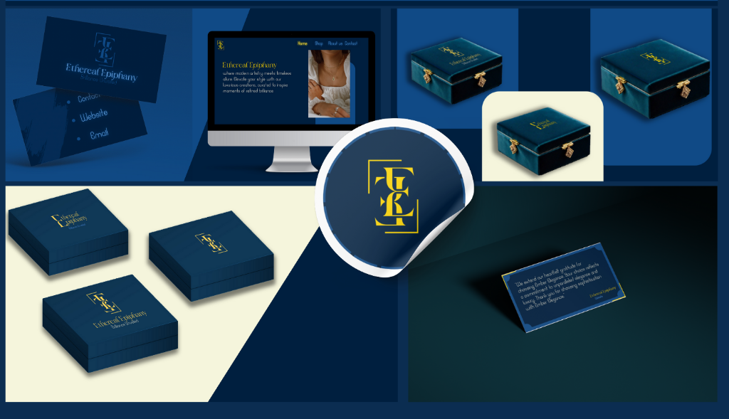
The identity system extends across every customer touchpoint — business cards with the monogram foil-stamped, a web storefront that pairs editorial photography with the navy-and-gold palette, velvet-finish jewelry boxes embossed with the mark, branded stickers, and thank-you cards that carry the brand's voice in gold type.
Collateral & Packaging Craft
Every piece is designed to feel like a gift. The jewelry boxes use a structured navy casing with gold clasp hardware, while the web experience balances editorial imagery with generous whitespace. Business cards carry the monogram at centre, foil-stamped to catch boutique lighting — a first impression that feels like the brand itself.
The Complete Work
Every element, one frame.
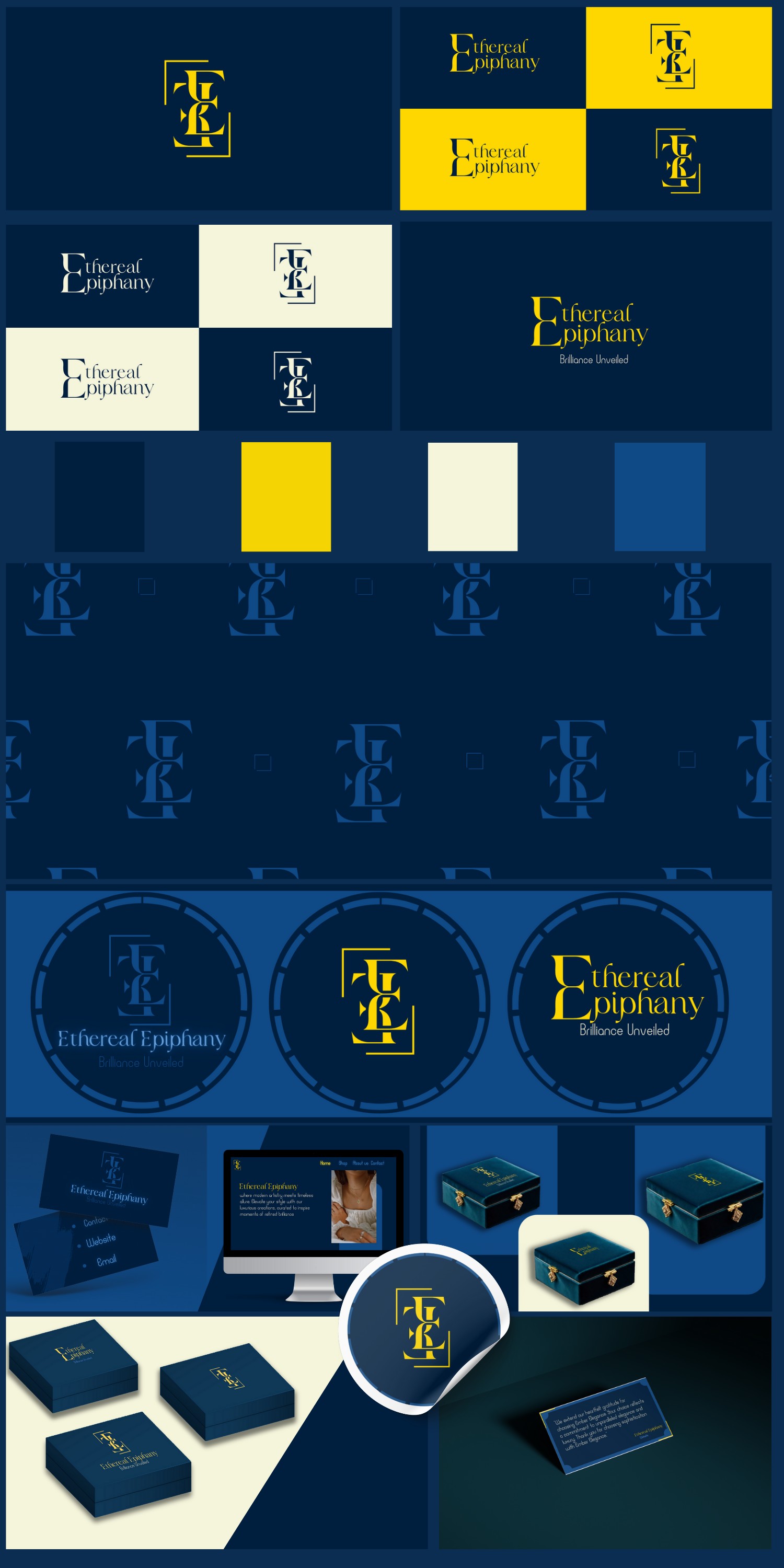
Monogram, wordmark, colour system, tone-on-tone pattern, jewelry box packaging, business cards, and web presence — the entire Ethereal Epiphany identity brought together as a single brand sheet.
Project Outcome
A brand built for
brilliance and permanence.
Ethereal Epiphany now carries a complete identity system — from monogram to jewelry box — that communicates quiet confidence and editorial luxury. Every element was designed to feel like it belongs in a world of precious things, never loud, always assured.
← View all projects