Case Study · No. 01
Buttermix "Sip the tradition, taste the Buttermix."
A mark that pours.
The Buttermix logo symbol takes the form of a stylised churning motion — an abstracted lassi glass with a straw, rendered as a fluid, organic shape. The mark captures the essence of traditional Indian buttermilk preparation while remaining modern enough to sit comfortably on a beverage can.
Design Approach
Drawn from the gestures of hand-churning curd, the glyph was reduced to its most essential curves. The deep aubergine ground gives the marigold mark maximum contrast and shelf-presence, even at thumbnail scale.
 View full size
Letters with warmth.
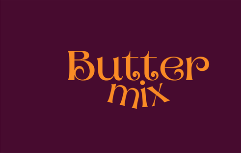
The "Buttermix" wordmark blends a high-contrast serif for "Butter" with a flowing script-style "mix" — marrying the brand's heritage rooting with its playful, approachable personality. Every curve was optically adjusted to feel hand-rendered rather than typeset.
Typographic Decisions
The interplay between the structured "B" and the casual descenders of "mix" creates a tension that mirrors the product itself — traditional recipes in a modern format. Kerning was tuned to keep the wordmark compact enough for narrow can labels.
 View full size
Motifs from the textile tradition.
A bespoke, repeating medallion pattern drawn from Indian textile and jali motifs — star-shaped rosettes at two scales that interlock into an infinite field. The pattern extends the brand's cultural DNA across every surface, from packaging backgrounds to promotional materials.
Pattern Construction
Each rosette combines an eight-pointed star silhouette with an organic swirl interior, balancing geometric precision and handcraft character. The two-scale repetition creates visual rhythm without monotony, and the aubergine-on-aubergine tonal range lets it recede behind type or stand alone as a brand texture.
 View full size
A system that holds everywhere.
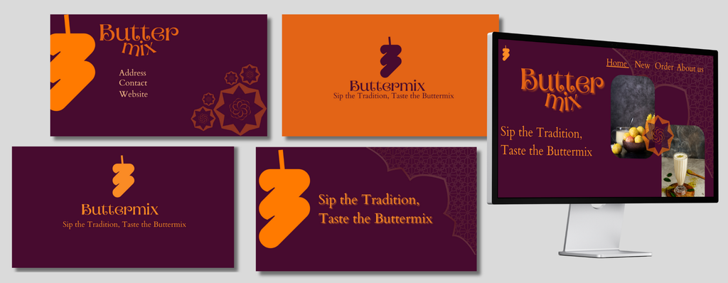
The complete brand identity unfolds across business cards, presentation decks, web landing pages, and stationery — every touchpoint carries the same tonal warmth. The dual-colour system (aubergine ground, marigold accents) ensures instant recognition whether the format is horizontal, vertical, digital, or print.
Collateral Design
Business cards use the logo mark as a centrepiece, while presentation layouts layer the custom pattern as a background texture. The web mockup demonstrates how typography hierarchy and colour translate to digital screens without losing the hand-crafted aesthetic.
 View full size
Shelf-ready and worth picking up.
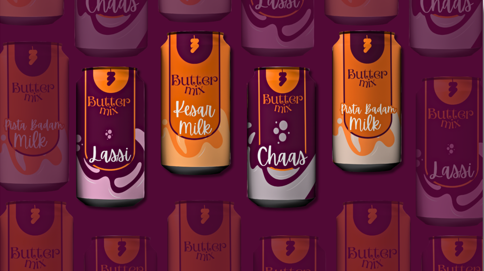
The packaging design brings together every element of the brand system — logo, wordmark, colour palette, and pattern — onto a can format. Each variant (Lassi, Kesar Milk, Chaas, Pista Badam Milk) carries a unique fluid splash treatment that differentiates flavour while the parent brand remains cohesive and unmistakable at shelf distance.
Packaging Craft
Each can features an arched label zone that frames the logo at top, a dynamic splash element that changes colour per flavour variant, and bold product naming in a custom script. The secondary cans appear tinted and faded in the background, reinforcing the product range as a family.
The Complete Work
Every element, one frame.
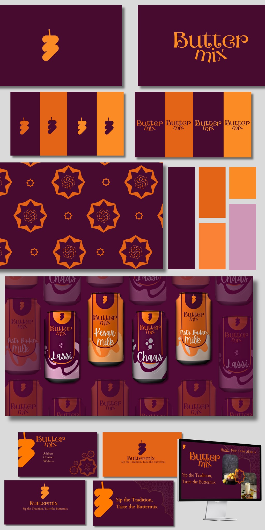
Logo mark, wordmark, colour system, pattern library, packaging range, and brand collateral — the entire Buttermix identity brought together as a single brand sheet.
Project Outcome
A brand built for
the shelf and the soul.
Buttermix now carries a complete identity system — from logo mark to packaging shelf — that honours the heritage of Indian dairy traditions while speaking confidently to a modern, urban audience. Every element was designed to work as part of a system, never in isolation.
← View all projects